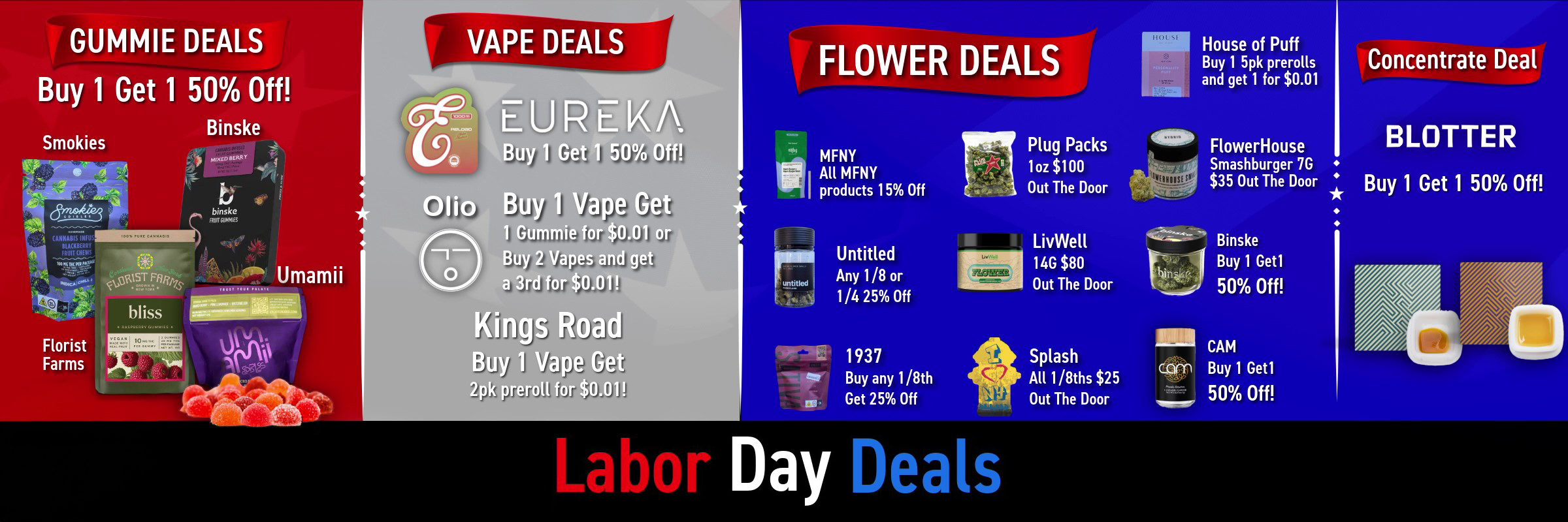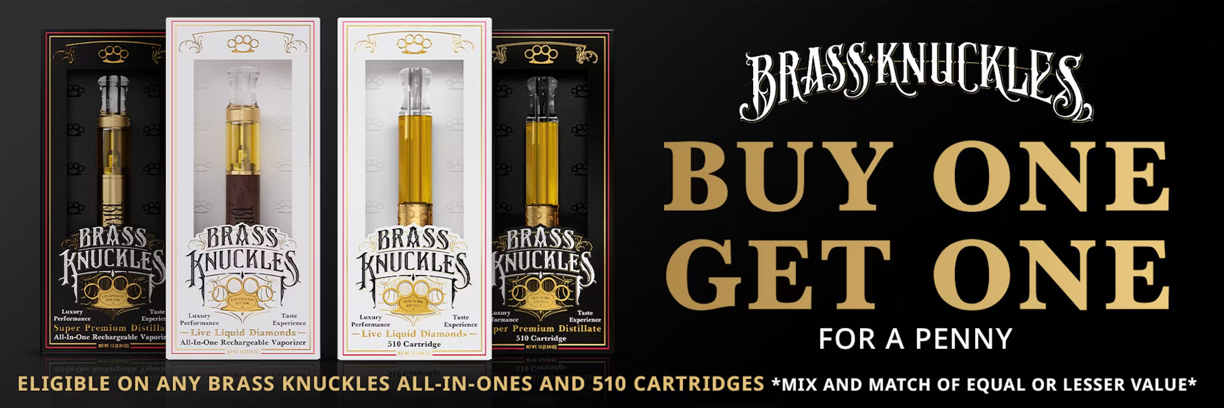
Dutchie Banner
Clean, high-contrast banners built to convert inside the Dutchie menu. Structured for quick scanning, instant clarity, and fast add-to-cart decisions without clutter.

On-brand menu banners built for clarity, speed and clicks. Correct specs, fast turnarounds, and a focus on conversion, not just impressions.
Use your existing creative or refine it with us.
Each layout keeps your brand intact while putting the offer up front. Clean type, strong contrast, and smart use of space help your promos stand out without fighting the menu UI.

Clean, high-contrast banners built to convert inside the Dutchie menu. Structured for quick scanning, instant clarity, and fast add-to-cart decisions without clutter.

Bold, promotion first layouts designed for Weedmaps placements. Built to communicate value instantly, and drive clicks without sacrificing brand polish.
These are the common production sizes we support. If your menu template uses custom slots, we’ll match them exactly.
| Placement | Size (px) | Format |
|---|---|---|
| Header Hero | 1600 × 600 | JPG/PNG |
| Banner Medium | 1200 × 400 | JPG/PNG |
| Tile Promo | 600 × 600 | JPG/PNG |
Safe zone: keep key text and logos at least 40px from the edges. Export at 2× resolution for crisp rendering on high-density screens.
| Placement | Size (px) | Format |
|---|---|---|
| Top Banner | 1440 × 400 | JPG/PNG |
| Mid Banner | 1200 × 360 | JPG/PNG |
| Promo Tile | 640 × 640 | JPG/PNG |
Use bold CTAs and strong contrast. Keep dark-mode menus in mind and avoid ultra-thin white outlines or low-contrast keylines.
Share the target products, price points, timing, and any existing brand assets (logo, colors, do/don’ts).
We design variants per placement, tuned to the Dutchie or Weedmaps frame so you can test what pulls best.
We deliver ready-to-upload files in the correct formats. Or, if you prefer, we can handle the upload for you.
What to expect when we build marketplace banners for Dutchie and Weedmaps.
All standard placements: Dutchie hero, medium, tiles, plus Weedmaps top, mid, and promo tiles.
High-contrast type, strong framing, and proper safe-zones so everything stays sharp inside marketplace UI.
Yes — fonts, colors, tone, and visual language are all brand-matched.
Most banners turn around in 24–48 hours.
Yes — variants are available as an add-on.
We’ll map banners to your menu flow, work from your existing creative or build new variants, and iterate so your best-performing assets stay in rotation.
Start a Project